

Mastering Angular Material M3 Theme: The Definitive Enterprise Guide for Advanced Color Customization
The rollout of Material 3 (M3) fundamentally re-engineered how Angular applications handle frontend styling. In legacy versions, developers were constrained to a rigid trifecta of Primary, Accent, and Warn palettes. Material 3 shatters this limitation by introducing a dynamic, tokenized system driven by comprehensive color roles.
However, implementing an Angular Material M3 Theme that gracefully manages secondary, tertiary, and high-contrast colors requires moving past basic documentation configurations. Without precise architecture, your styling layer can quickly degrade into a chaotic mix of broken property bindings and bloated production bundles.
This guide details a production-tested, bulletproof framework to initialize your application, implement custom M3 themes, map advanced variants, and protect application accessibility performance.
Step 1: Initializing Your Angular Project
Before configuration begins, you must establish a clean workspace using the latest version of the Angular CLI. Run the following command in your terminal to create a brand-new workspace:
Bash
ng new angular-m3-showcase --style=scss --ssr=false
Key Parameter Selections:
--style=scss: Absolute requirement. Angular Material 3 relies deeply on advanced Sass modules (@use,map.merge, and component mixins) to compile your themes.--ssr=false: Optional, but recommended for clean client-side state validation if you are focused strictly on frontend styling architecture.
Navigate directly into your new project directory:
Bash
cd angular-m3-showcase
Step 2: Installing and Scaffolding Your Angular Material M3 Theme Environment
Next, use the official schematic to add Angular Material to your project. This tool automatically hooks into your configuration, updates your dependencies, and structures your root setups:
Bash
ng add @angular/material
During the interactive installation prompt, configure the environment with the following options:
- Choose a predefined color palette: Select Custom to let us generate our own bespoke Material 3 token structure.
- Set up global Angular Material typography styles? Choose Yes to establish baseline font mappings globally.
- Include the Angular Animations module? Select Include to guarantee fluid transitions across components.
Generating the Angular Material M3 Colors File
Once the base package is configured, use the specialized theme-color schematic to generate your comprehensive M3 palette token maps:
Bash
ng generate @angular/material:theme-color --primary=#769CDF --secondary=#8991A2 --tertiary=#A288A6
This command builds an isolated file named _theme-colors.scss containing all your light, dark, and high-contrast variant color maps.
Step 3: Core Shift—How the Angular Material M3 Theme Handles Colors
Material 3 replaces static color assignments with a deep web of dynamic design tokens. Instead of modifying a single surface background color, your theme generates interconnected contextual roles.
Decoding the Angular Material M3 Color Palettes
When setting up your styles, the system leverages five core color palettes to establish consistent hierarchy:
- Primary: Reserved for dominant interactive elements, main call-to-actions, and key component states.
- Secondary: Used for less prominent canvas items, such as filter chips, auxiliary utilities, and secondary structural accents.
- Tertiary: Used for creative highlights, notice flags, badges, and balancing primary focal points.
- Neutral & Neutral Variant: Dictates the application canvas, background layers, card surfaces, dialog windows, and typography.
- Error: Universally maps to validation inputs, destructive UI prompts, and alert states.
The Container Token Hierarchy
Every individual color palette automatically generates localized child tokens to maintain accessible contrast boundaries. For instance, the Tertiary palette branches out into a modular ecosystem:
var(--mat-sys-tertiary): The dominant accent color layer.var(--mat-sys-on-tertiary): The precise text color engineered to meet contrast requirements when laid over the tertiary color background.var(--mat-sys-tertiary-container): A softer, low-luminance variation ideal for structural component containment.var(--mat-sys-on-tertiary-container): Highly readable typographic coloring meant exclusively for text residing inside the container variant.
Step 4: Designing a Scalable Angular Material M3 Theme Palette Structure
To manage color tokens effectively, keep your auto-generated maps inside _theme-colors.scss and implement them within your global layout sheet (styles.scss).
Here is the structural code for your color definitions file, containing your generated light theme maps and targeted high-contrast tokens.
File: _theme-colors.scss
SCSS
// This file was generated by running 'ng generate @angular/material:theme-color'.
// Proceed with caution if making changes to this file.

@use 'sass:map';
@use '@angular/material' as mat;

$_palettes: (
  primary: (
    0: #000000, 10: #001b3e, 20: #002f64, 25: #033a77, 30: #194683, 35: #285290,
    40: #365e9d, 50: #5177b8, 60: #6b91d3, 70: #86acf0, 80: #aac7ff, 90: #d6e3ff,
    95: #ecf0ff, 98: #f9f9ff, 99: #fdfbff, 100: #ffffff,
  ),
  secondary: (
    0: #000000, 10: #141c29, 20: #29313f, 25: #343c4a, 30: #3f4756, 35: #4b5362,
    40: #575f6e, 50: #6f7788, 60: #8991a2, 70: #a3abbd, 80: #bfc7d9, 90: #dbe3f5,
    95: #ecf1ff, 98: #f9f9ff, 99: #fdfbff, 100: #ffffff,
  ),
  tertiary: (
    0: #000000, 10: #27142c, 20: #3d2942, 25: #49344e, 30: #553f5a, 35: #614b66,
    40: #6e5772, 50: #876f8c, 60: #a288a6, 70: #bea2c1, 80: #dabddd, 90: #f7d9fa,
    95: #ffebff, 98: #fff7fb, 99: #fffbff, 100: #ffffff,
  ),
  neutral: (
    0: #000000, 10: #1b1b1e, 20: #303033, 25: #3b3b3e, 30: #464649, 35: #525255,
    40: #5e5e61, 50: #777779, 60: #919093, 70: #acabae, 80: #c7c6c9, 90: #e4e2e5,
    95: #f2f0f3, 98: #fbf8fc, 99: #fefbff, 100: #ffffff, 4: #0d0e10, 6: #131316,
    12: #1f1f22, 17: #292a2c, 22: #343437, 24: #39393c, 87: #dbd9dc, 92: #eae7ea,
    94: #efedf0, 96: #f5f3f6,
  ),
  neutral-variant: (
    0: #000000, 10: #191c22, 20: #2e3037, 25: #393b42, 30: #44474e, 35: #505259,
    40: #5c5e66, 50: #75777f, 60: #8e9098, 70: #a9abb3, 80: #c5c6cf, 90: #e1e2eb,
    95: #eff0f9, 98: #f9f9ff, 99: #fdfbff, 100: #ffffff,
  ),
  error: (
    0: #000000, 10: #410002, 20: #690005, 25: #7e0007, 30: #93000a, 35: #a60f13,
    40: #b81f1e, 50: #db3a33, 60: #ff5449, 70: #ff897d, 80: #ffb4ab, 90: #ffdad6,
    95: #ffedea, 98: #fff8f7, 99: #fffbff, 100: #ffffff,
  ),
);

$_rest: (
  secondary: map.get($_palettes, secondary),
  neutral: map.get($_palettes, neutral),
  neutral-variant: map.get($_palettes, neutral-variant),
  error: map.get($_palettes, error),
);

$primary-palette: map.merge(map.get($_palettes, primary), $_rest);
$tertiary-palette: map.merge(map.get($_palettes, tertiary), $_rest);

@function _high-contrast-value($light, $dark, $theme-type) {
  @if ($theme-type == light) { @return $light; }
  @if ($theme-type == dark) { @return $dark; }
  @if ($theme-type == color-scheme) { @return light-dark(#{$light}, #{$dark}); }
  @error 'Unknown theme-type #{$theme-type}. Expected light, dark, or color-scheme';
}

@mixin high-contrast-overrides($theme-type) {
  @include mat.theme-overrides(
    (
      primary: _high-contrast-value(#002b5d, #ebf0ff, $theme-type),
      on-primary: _high-contrast-value(#ffffff, #000000, $theme-type),
      primary-container: _high-contrast-value(#1c4986, #a4c3ff, $theme-type),
      on-primary-container: _high-contrast-value(#ffffff, #000b20, $theme-type),
      inverse-primary: _high-contrast-value(#aac7ff, #1a4785, $theme-type),
      primary-fixed: _high-contrast-value(#1c4986, #d6e3ff, $theme-type),
      primary-fixed-dim: _high-contrast-value(#003269, #aac7ff, $theme-type),
      on-primary-fixed: _high-contrast-value(#ffffff, #000000, $theme-type),
      on-primary-fixed-variant: _high-contrast-value(#ffffff, #00112b, $theme-type),
      secondary: _high-contrast-value(#242c3a, #eaf0ff, $theme-type),
      on-secondary: _high-contrast-value(#ffffff, #000000, $theme-type),
      secondary-container: _high-contrast-value(#414958, #bbc3d5, $theme-type),
      on-secondary-container: _high-contrast-value(#ffffff, #040b18, $theme-type),
      secondary-fixed: _high-contrast-value(#414958, #dbe3f5, $theme-type),
      secondary-fixed-dim: _high-contrast-value(#2b3341, #bfc7d9, $theme-type),
      on-secondary-fixed: _high-contrast-value(#ffffff, #000000, $theme-type),
      on-secondary-fixed-variant: _high-contrast-value(#ffffff, #09111e, $theme-type),
      tertiary: _high-contrast-value(#39253e, #ffe9ff, $theme-type),
      on-tertiary: _high-contrast-value(#ffffff, #000000, $theme-type),
      tertiary-container: _high-contrast-value(#57425c, #d6b9d9, $theme-type),
      on-tertiary-container: _high-contrast-value(#ffffff, #15051b, $theme-type),
      tertiary-fixed: _high-contrast-value(#57425c, #f7d9fa, $theme-type),
      tertiary-fixed-dim: _high-contrast-value(#402b45, #dabddd, $theme-type),
      on-tertiary-fixed: _high-contrast-value(#ffffff, #000000, $theme-type),
      on-tertiary-fixed-variant: _high-contrast-value(#ffffff, #1c0a21, $theme-type),
      background: _high-contrast-value(#fbf8fc, #131316, $theme-type),
      on-background: _high-contrast-value(#1b1b1e, #e4e2e5, $theme-type),
      surface: _high-contrast-value(#fbf8fc, #131316, $theme-type),
      surface-dim: _high-contrast-value(#bab8bb, #131316, $theme-type),
      surface-bright: _high-contrast-value(#fbf8fc, #505052, $theme-type),
      surface-container-low: _high-contrast-value(#f2f0f3, #1f1f22, $theme-type),
      surface-container-lowest: _high-contrast-value(#ffffff, #000000, $theme-type),
      surface-container: _high-contrast-value(#e4e2e5, #303033, $theme-type),
      surface-container-high: _high-contrast-value(#d6d4d7, #3b3b3e, $theme-type),
      surface-container-highest: _high-contrast-value(#c7c6c9, #464649, $theme-type),
      on-surface: _high-contrast-value(#000000, #ffffff, $theme-type),
      shadow: _high-contrast-value(#000000, #000000, $theme-type),
      scrim: _high-contrast-value(#000000, #000000, $theme-type),
      surface-tint: _high-contrast-value(#365e9d, #aac7ff, $theme-type),
      inverse-surface: _high-contrast-value(#303033, #e4e2e5, $theme-type),
      inverse-on-surface: _high-contrast-value(#ffffff, #000000, $theme-type),
      outline: _high-contrast-value(#292c33, #eeeff8, $theme-type),
      outline-variant: _high-contrast-value(#464950, #c1c2cb, $theme-type),
      error: _high-contrast-value(#600004, #ffece9, $theme-type),
      on-error: _high-contrast-value(#ffffff, #000000, $theme-type),
      error-container: _high-contrast-value(#98000b, #ffaea5, $theme-type),
      on-error-container: _high-contrast-value(#ffffff, #220001, $theme-type),
      surface-variant: _high-contrast-value(#e1e2eb, #44474e, $theme-type),
      on-surface-variant: _high-contrast-value(#000000, #ffffff, $theme-type),
    )
  );
}
Step 5: Direct Variant Control and Class Injection inside styles.scss in Angular Material M3
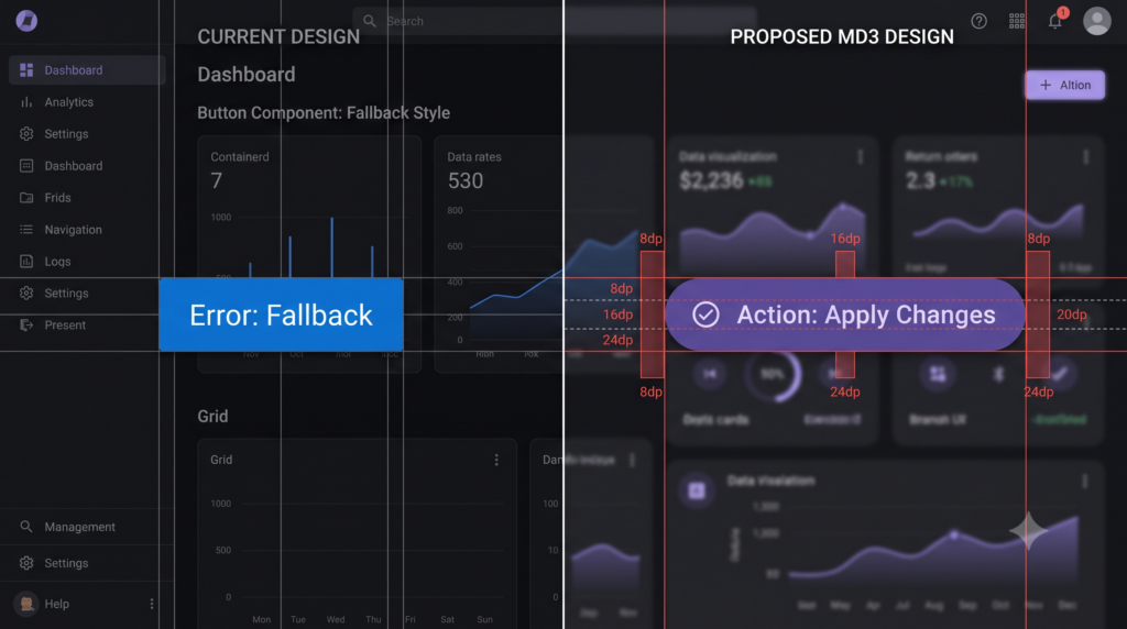
In Material 3, components do not ship with built-in styling hooks for all variant strings out of the box. For instance, if you apply color="secondary" or color="tertiary" to a basic button element, the component fallback mechanisms default the rendering to your Primary scheme.
To solve this, implement a clean loop that hooks into the component color mixins explicitly. This maps template attributes to their real M3 palette configurations without manually writing repetitive code.
To better understand how this programmatic mapping relates to Angular’s architecture, check out our guide on Internal Component State Engineering or explore the official Material Design 3 Token Documentation.
File: styles.scss
SCSS
// ==========================================================================
// 1. ARCHITECTURAL DEPENDENCIES & CORE SETUP
// ==========================================================================
@use '@angular/material' as mat;
@use './theme-colors' as custom-theme;

// Initialize core Material structural styles
@include mat.core();

// ==========================================================================
// 2. DEFINE BASE THEME CONFIGURATION
// ==========================================================================
$theme: mat.define-theme((
  color: (
    theme-type: light,
    primary: custom-theme.$primary-palette,
    tertiary: custom-theme.$tertiary-palette,
  ),
  typography: (
    plain-family: Inter,
    brand-family: Inter,
  ),
  density: (
    scale: 0,
  ),
));

// ==========================================================================
// 3. INJECT COMPONENT EMISSION LAYER
// ==========================================================================
// Apply the baseline themes globally
@include mat.all-component-themes($theme);

html {
  height: 100%;
  @include mat.system-level-colors($theme);
  @include mat.system-level-typography($theme);
}

body {
  color-scheme: light;
  background-color: var(--mat-sys-surface);
  color: var(--mat-sys-on-surface);
  font: var(--mat-sys-body-medium);
  margin: 0;
  height: 100%;
}

// ==========================================================================
// 4. ACCESSIBILITY LAYER (HIGH-CONTRAST OVERRIDES)
// ==========================================================================
// A. Native OS-Level High Contrast Mode Detection
@media (forced-colors: active) {
  @include custom-theme.high-contrast-overrides(light);
}

// B. Application-Driven High Contrast Mode Switch (Toggled via CSS Class)
.is-high-contrast {
  @include custom-theme.high-contrast-overrides(light);
}

// ==========================================================================
// 5. EXPLICIT M3 COLOR VARIANT OVERRIDES
// ==========================================================================
// Maps template attributes (color="accent", color="tertiary", etc.)
// cleanly across your chosen component bundle variations.
$variants: (
  "accent": secondary,
  "tertiary": tertiary,
  "warn": error
);

@each $class, $variant in $variants {
  .mat-#{$class} {
    @include mat.button-color($theme, $color-variant: $variant);
    @include mat.progress-spinner-color($theme, $color-variant: $variant);
    @include mat.progress-bar-color($theme, $color-variant: $variant);
    @include mat.slide-toggle-color($theme, $color-variant: $variant);
    @include mat.slider-color($theme, $color-variant: $variant);
    @include mat.checkbox-color($theme, $color-variant: $variant);
    @include mat.radio-color($theme, $color-variant: $variant);
    @include mat.badge-color($theme, $color-variant: $variant);
  }
}
Best Practices for High-Contrast Accessibility in Angular Material M3
Accessibility is a core requirement of Material 3 architectures. The integration of high-contrast overrides in the global styles.scss relies on a dual-activation pattern.
Automated Hardware Matching via forced-colors
The inclusion of the @media (forced-colors: active) block queries the user’s operating system directly. When a user with a visual impairment activates high-contrast visibility settings natively on Windows or macOS, the browser forwards this instruction to the application. The system immediately substitutes subtle hues with clear borders and stark typographic styling, minimizing user friction.
Programmatic Manual Toggle Overrides
Because users may lack permission to adjust system-wide options on public or corporate networks, the .is-high-contrast class selector serves as an in-app toggle anchor. By binding a global state flag to the root HTML container using a standard Angular directive, users can activate the high-contrast view manually through your interface. For deeper routing details, see our guide on Advanced UX Accessibility Patterns.
TypeScript
// Example toggle pattern within your application root component
import { Component, Renderer2, Inject } from '@angular/core';
import { DOCUMENT } from '@angular/common';

@Component({
  selector: 'app-root',
  template: `<button (click)="toggleContrast()">Toggle Contrast</button>`
})
export class AppComponent {
  private isHighContrast = false;

  constructor(
    private renderer: Renderer2,
    @Inject(DOCUMENT) private document: Document
  ) {}

  toggleContrast() {
    this.isHighContrast = !this.isHighContrast;
    const target = this.document.documentElement;

    if (this.isHighContrast) {
      this.renderer.addClass(target, 'is-high-contrast');
    } else {
      this.renderer.removeClass(target, 'is-high-contrast');
    }
  }
}
Optimizing Bundle Size Performance
A common pitfall in Material 3 architectures is importing theme structures directly into lazy-loaded feature components.
Because the styles.scss sheet calls structural compilation targets like @include mat.all-component-themes($theme);, importing this file down the dependency line causes the compiler to copy the entire component design layout map into every single component bundle.
Rules for Production Safety
- Declare Global Mixins Once: Keep component theme initializations explicitly bound inside the main
styles.scssfile declared inside yourangular.jsonstyles collection array. - Component-Level Encapsulation: If an isolated feature component requires targeted access to a system style attribute, leverage CSS Custom Properties (
var(--mat-sys-*)) directly within the local view sheet rather than using a Sass@useimport of the global style file.
FAQ Section
Why does color=”tertiary” fall back to primary on my buttons when using the Angular Material M3 Theme?
By default, the internal theme compilation files for Angular Material 3 buttons leave variant target classes like .mat-tertiary empty to reduce CSS output size. To use this property attribute value cleanly in your templates, you must map the theme variables using the component mixin @include mat.button-color($theme, $color-variant: tertiary); inside your global stylesheet.
How do I use the secondary color palette in Angular Material M3 theme?
To map secondary tokens to your UI layout elements, use the built-in attribute variant map definitions. In M3 templates, the secondary palette is called using the traditional color="accent" structural attribute, which maps directly to the compiled .mat-accent selector classes.
What is the purpose of the mat.system-level-colors mixin?
The mat.system-level-colors mixin maps foundational design tokens directly onto your root elements. It establishes global CSS variables across the document canvas, automatically defining base background levels (--mat-sys-surface) and primary text typography values across the runtime surface.
Do you want to know how to use latest Signal Store in Angular 22 click here


![Zoneless Angular 22 Apps: [Ultimate] Performance Guide](https://coregamix.com/wp-content/uploads/2026/08/Gemini_Generated_Image_sl7y99sl7y99sl7y-scaled.png)